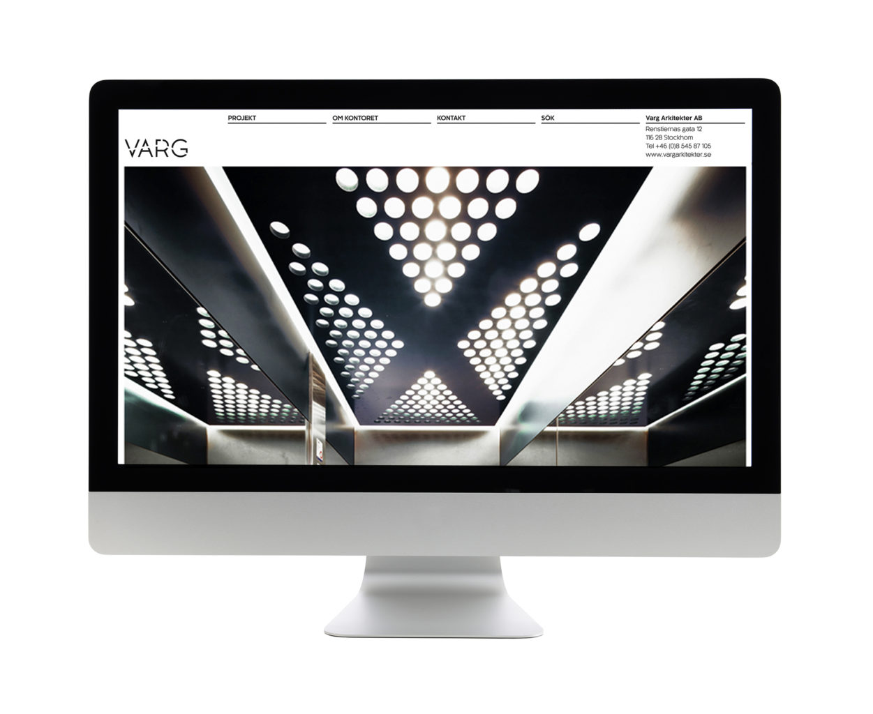
The image concept for this website is based on the idea of showing different scale at the same time, both human scale and and building scale. The design adheres to the overall identity, view identity project here.View website here.
Facebook
X
LinkedIn
Startpage
The website design is based on a grid system of 1, 2, 3 or 4 set columns, depending on browser size. The grid adjust depending on browser size.
Startpage for laptop, 4 columns grid
Startpage for laptop, 3 columns grid
Startpage for Phone & pad, 1 & 2 columns grid
In order to maintain typographic integrity, the images scale continuously, while the type only has fixed sizes, changing only at set breakpoints.
Navigation
Navigation for Phone, 2 levels
Page templates
We designed 6 different individual page types, for different type of content:
Startpage, two types of all projects pages, the individual projekt page, text content page and a CV page.
The design of these template pages changes at each responsive breakpoint (phone, laptop, desktop & maximum size).
All projects-page for laptop
Project page, for laptop
In order to accommodate many different kinds of projects with different types of content, the layout for the individual project page had to be flexible yet coherent with the overall design.
We developed 4 types of templates (A-D), that can be stacked in any order, so potentially each project-page can look slightly different while still adhering to the general structure of the site.


